
This is a Section Title (H3)
The above image is an example of the Display Banner component.
When you want to add an image to the top of the page, you have three options to choose from.
1. Using the Hero Component on the Edit Screen
The hero component is a good choice when you don't want text over the image but do want to customize the title and/or add a subheading line above or below the main title. The hero can be accessed only from the Edit Screen. You DO NOT have to hide the normal page title when using the hero component.
2. Using the Display Banner Component
The main reason you would want to use the display banner component is if you want text and/or buttons overlaid on top of the image. This is the only way to do that. For this option you DO need to hide the page title, (Checkbox on the Edit Screen) and your layout section should be Edge to Edge width and no default top and bottom margin.
3. Adding a normal full width image using the simple media component.
If you alreay have a really wide image (not too tall) that would otherwise be ruined by the auto cropping of the first two options, you can insert a top image using the simple media component in a edge to edge section, with no top or bottom margin. You SHOULD hid the page title when doing this, and add your own page in a text section below.

The above is an example of the simple media component, crop set to square, with the unl frame enabled. Simple media elements always fill the column width they are in.
This is the optional overline
This is a Card Title
This is the optional subhead
This is an example of a "card". Cards can be used with or without images, but always need a title. You can create cards with different backgroud colors to make them "pop" out compared to the background.
This is a card button.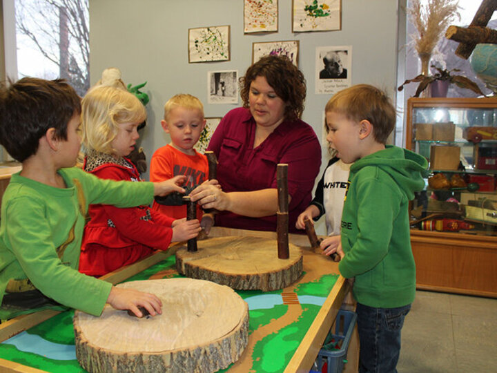
Accordion Example
The following is an accordion. The accordion component can have as many expandable sections as you need. The accordian component has a required title, but for CEHS sites it is not displayed. We choose to do this because we did not feel an accordion title is always needed. If you do need add a title or some text above it, as we are doing here, you can simply place a text area above it.
This Title is Not Used
Expandable Section Number 1
Lorem ipsum dolor sit amet, consectetur adipiscing elit. Pellentesque in elit fermentum, pellentesque eros id, facilisis felis. Proin ultrices est ex, in volutpat metus auctor quis. Vestibulum feugiat nisl ut lobortis varius. Ut non vestibulum justo. Donec nec faucibus nulla. Sed mattis blandit nibh at dictum. Nulla vel tellus nisi. Nulla at dictum odio, quis malesuada enim. Suspendisse imperdiet magna quis massa tempus, eget pharetra tellus iaculis. Fusce tincidunt quis odio nec interdum. Vestibulum porttitor augue est, nec feugiat odio rutrum non. Maecenas ut tellus non nulla pellentesque porta a nec lectus. Sed tellus lorem, efficitur vel aliquam ut, euismod vitae enim.
Expandable Section Number 2
Integer volutpat urna nec risus hendrerit posuere. In feugiat pellentesque velit in volutpat. Donec nec diam ultrices urna dapibus volutpat. Morbi consequat ac orci auctor molestie. Donec quis placerat odio. Aenean euismod laoreet eros, ac faucibus sem lobortis ut. Vestibulum vel vestibulum quam.
Yet Another Expandable Section
Nunc faucibus varius ligula, in aliquet augue porta sed. Aliquam purus ex, feugiat vitae quam ut, semper commodo purus. Phasellus at suscipit orci. Mauris ullamcorper sem eu leo feugiat euismod. Sed tristique eget purus vel pulvinar. Maecenas ullamcorper velit vel erat sagittis congue. Mauris ultricies eu urna euismod sagittis. Mauris eleifend sapien ac iaculis porttitor. Nullam vulputate lectus ac orci accumsan, non maximus odio euismod. Aenean risus lectus, semper et tellus ac, mattis fringilla libero. Aliquam pellentesque justo non augue hendrerit accumsan. Aliquam tincidunt venenatis leo, id finibus felis mollis id. Nullam elementum vulputate leo a ullamcorper.
Below is an example of a "proof point", a way to highlighting a statistic or number, and the context.
CALL TO ACTION TITLE
This component is best used in an edge to edge section, with no top/bottom margin. You can set the color
The social media component is meant to be used as a full band at the end of a page as demonstrated below, and is always red (Single Section, Edge to Edge, No Default Top/Bottom Margin)
However It can also be used as standalone element in a column in some cases, as shown to the right.